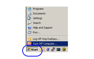
Why Have a Start Button to Shutdown Windows?

The other day I was watching David Pogue’s presentation When it comes to tech, simplicity sells on Ted Talks about good and bad UI design, which overall was very good. However good UI (User Interface) design is not always as obvious as he makes it out to be, and sometimes it’s even very counter-intuitive.
For example, it’s very easy to bash Microsoft Windows. Not that I’m a “fanboy” of any particular operating system, at LandlordMax we work with Microsoft Windows, Mac OS, and Linux, so I’m pretty operating system agnostic. In any case, David presented some good examples of good and bad UI design, and in most cases he was 100% right. In one comparison, for example, he compared the difference between the shutdown menus on Windows and the Mac OS. The Mac OS definitely had a more obvious and easier user interface.
What got my attention however, and the reason I’m writing today, is that he also made a passing joke about Windows and how you shut it down. He said “Why in gods name do you shutdown a Windows PC by clicking on a button called Start” (approx 11 minutes into the presentation) which drew some laughter from the audience. I agree his comment makes sense intuitively, but he’s unfortunately wrong in this case.
Raymond Chen writes about Microsoft’s decision to use the “Start” button in his book The Old New Thing. It’s too bad David hasn’t read Raymond’s book or blog post about the decision to use the Start button. Basically it goes that in the beginning of Windows there was no “Start” button, they only added it after going through some usability testing.
To quote Chen (the highlights are my own):
Back in the early days, the taskbar didn’t have a Start button. (In a future history column, you’ll learn that back in the early days, the taskbar wasn’t called the taskbar.)
Instead of the Start button, there were three buttons in the lower left corner. One was the “System” button (icon: the Windows flag), one was the “Find” button (icon: an eyeball), and the third was the “Help” button (icon: a question mark). “Find” and “Help” are self-explanatory. The “System” button gave you this menu:
Run…
Task List…
Arrange Desktop Icons
Arrange Windows 4
Shutdown Windows(“Arrange Windows” gave you options like “Cascade”, “Tile Horizontally”, that sort of thing.)
Of course, over time, the “Find” and “Help” buttons eventually joined the “System” button menu and the System button menu itself gradually turned into the Windows 95 Start menu.
But one thing kept getting kicked up by usability tests: People booted up the computer and just sat there, unsure what to do next.
That’s when we decided to label the System button “Start”.
It says, “You dummy. Click here.” And it sent our usability numbers through the roof, because all of a sudden, people knew what to click when they wanted to do something.
So why is “Shut down” on the Start menu?
When we asked people to shut down their computers, they clicked the Start button.
Because, after all, when you want to shut down, you have to start somewhere.
(Besides, if we also had a “Shut down” button next to the Start button, everybody would be demanding that we get rid of it to save valuable screen real estate.)”
The morale of the story, be careful before you start trashing user interfaces, there might just be a reason for some odd solutions.

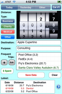
And this was proved again recently in the post Learning from “bad” UI on Signal Versus Noise when Ryan walked us through the UI design of TripLog/1040. This UI at first seems to be horribly designed, with no thought at all given to it. But once you understand the reasoning and usability behind it, you quickly realize that it was indeed very well designed and that a LOT of thought was actually given to the design of its UI!
Of course many UI’s are just badly designed, there’s no question about it. It’s just that sometimes the obvious is not so obvious!


· August 5th, 2008 · 3:46 am · Permalink
“Because, after all, when you want to shut down, you have to start somewhere.”
or
“Because, after all, when you want to shut down, you have to do something.”
Why not simply rename the ‘Start’ button to ‘Do’ or something similar (or even just a symbol). According to you, the ‘Start’ button says, “You dummy. Click here.”. I’m sure this could be achieved with another word too (“Do”, or a symbol (flashy or not to attract attention), etc.)
If the whole point of the ‘Start’ button is to make people click on it, I’m sure they could have come up with something better (keeping in mind you only need to tell the users about it a few times only; after a few days s/he will remember how to shutdown the PC anyway).
· August 5th, 2008 · 12:13 pm · Permalink
Hi Anthony,
That’s a good question, is “Start” the best word? I suspect they tried more than one word, but I can’t know for sure as I wasn’t there.
The only way to know is to try it.
For me personally, it doesn’t make sense to have a Start button to shutdown a PC, but the data from the usability tests show otherwise…
· August 5th, 2008 · 9:46 pm · Permalink
Thanks for the article Steph. My hobby is studying UI design. It’s not an easy process, one of my favourite books on the subject (and one I frequently disagree with too) is Principles of User Interface Design. It’s getting a bit long in the tooth now though.
Regarding “Do” as opposed to “Start”. “Do” does not a nice button size make, for starters. Balance is also part of UI design. In addition “Do” is requires framing within a context. You can’t say “Do Shutdown” in anything except broken English. However “Start Shutdown” is gramatically OK. Probably not a lightening bolt moment for the designers, but most probably a part of the decision. In addition “Start” has a deeper conentation for action that is “easy” and “rewarding” than “do” which tends to sound a little more utilitarian. In the case of Windows 95 this would tie in with the fact that MS were marketing to a section of the community who previously did not get it in relation to computers and Windows UI’s in particular.
· August 6th, 2008 · 10:19 am · Permalink
[…] “The morale of the story, be careful before you start trashing user interfaces, there might ju… […]
· August 18th, 2008 · 8:58 am · Permalink
Everything must have a begining, even the end.
Another word that comes to mind is ‘begin’
‘Begin Shutdown’ sounds better, right?
But how about ‘Begin Programs’?
And you are forgetting something else – do is a word that only English-speaking people understand.
In my country (in East-Europe) everybody knows what a start is – because of sports or car engines or something.
· August 18th, 2008 · 11:25 am · Permalink
I do not understand the discussion. “If you want to shutdown you have to start somewhere” I would be very very surprised if anyone actually thought that (thought they might come up with it as an explanation after the fact). What I really think the argument should be is that there is this button, you use it for lots of things, after clicking it once you see quite a bit of what it does, the only time you have never clicked on it yet is when you are starting out. Seems a reasonable explanation.
Of course, after that you should give the user some options to change the configuration. No more need for the word, and since it is in a corner you really can make it very small indeed.
· August 18th, 2008 · 11:53 am · Permalink
“Make It So” would take up twice the real estate. But it wouldn’t seem oxymoronic for shutdown and it would make the Star Trek fans smile.
· August 18th, 2008 · 12:02 pm · Permalink
> Star Trek fans smile
LOL! As would “Take us out.” 😉
· August 18th, 2008 · 2:53 pm · Permalink
I guess some of you have not seen that Vista no longer carries the “Start” next to the Windows symbol. So after 13, or so, years the UI design team gathered that we know what to do. David’s point is now irrelevant. I’m going to go out on a limb and say that Windows 7 will continue with the same guideline.
If I recall correctly, many default themes for gnome and KDE in the 90s had “Start” buttons.
· August 19th, 2008 · 11:01 am · Permalink
The bit I can’t work out is why is this question being asked now? The start button has been in Windows since Windows 95.
https://www.guidebookgallery.org/screenshots/win95
· August 28th, 2008 · 10:39 am · Permalink
[…] Raymond Chen (via) You can follow any responses to this entry through the RSS 2.0 feed. You can leave a response, […]
· August 1st, 2010 · 6:20 am · Permalink
[…] “The morale of the story, be careful before you start trashing user interfaces, there might ju… […]