More LandlordMax Sales Metrics
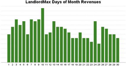
Last week I promised I would post a follow-up article to my previous one about our sales metrics at LandlordMax, where I would show our daily sales averages over a month. Well here’s the graph below:

It’s not exactly what you would expect from a property management software application is it? To quote Eric, the founder of RentARoom.ca, who commented on my previous post (thanks Eric):
“Beginning of the month is probably slow, rising to mid month to it’s peak, and the last days of the month fairly low sales as well. The slowest days: First to Third of the month.
I guess property managers are busy trying to get it all done in their old system. They give up by mid month, or catch their breaths and say they have to find an “easier” way by next month and find a new program.
So by that, advertising just before mid month would be best. (depending on first ad seen -first visit to the website- and conversion to a buying decision)”
That was exactly my initial thoughts. And this proves why it’s so important to get real hard data rather than assuming. In this case common sense is wrong, including mine. The best days for our sales are at the beginning of the month, when landlords and property management companies are at their busiest.
Not only that, but when they’re at their quietest time is when we get the least sales. In other words when we expect the most sales is when we’ll get the least!
Why is the real buying pattern almost the opposite of what we’d expect? Although I don’t know for sure and I can only speculate, my guess is they buy LandlordMax when they’re experiencing their biggest pains. That is they buy it when they need it most rather than when they have the most time. The biggest time for sales is when all the rents are due.
Interesting isn’t it? Common sense in this case proves to be wrong. Getting cold hard data made a real difference, it was very educational. It’s also a very big reminder to always double check your intuition with data. I’m sure glad I did!


· April 16th, 2008 · 10:50 pm · Permalink
Thanks Steph,
For the graph, explanation, and the ebook.
Steph always delivers; I got the ebook in my inbox (as promised in the question contest)before I could read this post.
I look forward to learning even more by reading the ebook in its entirety.
The data follows some of the sales “tactics”. Find their pain, and solve it. I would have thought that in the middle of the crunch, property managers would just get it done, and then move to action to avoid next month’s pain.
But as our US friends have just finished, and Canadians are about to finalize their tax filling… In the past, I have run out to buy the tax software the final tax-filing day. Never have I bought it just after tax season to get a jump on next year 🙂
Test, test, test and test again, would be a great motto! Right Steph?
· April 17th, 2008 · 12:30 am · Permalink
Hi there. The left side of your graph got cut off so the numbers on the vertical scale aren’t visible. Can you fix that?
· April 17th, 2008 · 1:45 pm · Permalink
Hi Eric,
You’re welcome.
And you’re exactly right with your analogy. I suspect that most of the consumer tax software sales happen the month before taxes are due.
Test test test! 🙂
· April 17th, 2008 · 1:51 pm · Permalink
Hi Reader,
The left side actually isn’t cut off, I intentionally left it out. I’m willing to share our sale trends, including the scales of our sales, but not actual numbers.